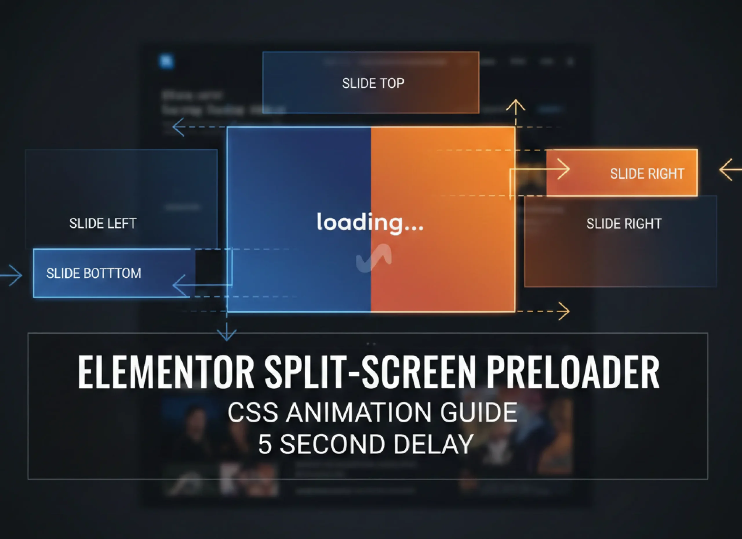
Enhance your website’s user experience (UX) with a professional, high-end split-screen Preloader in Elementor. This guide explains how to use custom CSS to create sections that slide out of view—left, right, top, or bottom—after a specific delay.
Step 1: Add the Custom CSS
To make the animations work, you need to add the following code to your website. Navigate to Appearance > Customize > Additional CSS or paste it into Elementor > Settings > Custom CSS.
					/* Custom Split-Screen Animation
   Description: Elements slide out after a 5-second delay.
*/

@keyframes slideOutLeft { 100% { transform: translateX(-100%); opacity: 0; visibility: hidden; } }
@keyframes slideOutRight { 100% { transform: translateX(100%); opacity: 0; visibility: hidden; } }
@keyframes slideOutUp { 100% { transform: translateY(-100%); opacity: 0; visibility: hidden; } }
@keyframes slideOutDown { 100% { transform: translateY(100%); opacity: 0; visibility: hidden; } }

.slide-left, .slide-right, .slide-top, .slide-bottom {
    animation-duration: 1s;
    animation-delay: 5s;
    animation-fill-mode: forwards;
    pointer-events: none; /* Prevents blocking clicks after disappearing */
    z-index: 9999; /* Keeps the preloader on top */
}

.slide-left { animation-name: slideOutLeft; }
.slide-right { animation-name: slideOutRight; }
.slide-top { animation-name: slideOutUp; }
.slide-bottom { animation-name: slideOutDown; }
Step 2: Configure Your Elementor Sections
Create Your Preloader: Design the sections you want to use as a preloader at the very top of your page.
Set to Full Width: Ensure the section is set to Full Width and has a specific height (e.g.,
100vh) to cover the screen.
Assign CSS Classes:
- Select the Section or Column you want to animate.
- Go to the Advanced tab.
- In the CSS Classes field, enter one of the following names (without a dot):
slide-left(To slide out to the left)slide-right(To slide out to the right)slide-top(To slide out to the top)slide-bottom(To slide out to the bottom)
Step 3: Key Benefits for SEO and UX
Engagement: A well-designed preloader keeps users engaged while the main content loads in the background.
Performance: Using pure CSS animations instead of heavy JavaScript plugins improves PageSpeed scores.
Visual Hierarchy: These animations create a “theatrical” opening effect, making your brand feel more premium.
Pro Tip: If you want the animation to start faster, simply change the
5sin the CSS code to3sor2s.

Detailed CSS Breakdown for Each Animation
If you want to use only specific animations or understand how each class works, here is the individual code for each direction. Copy the class you need and apply it to your Elementor elements.
1. Slide Out Left
This class will move your section or column to the left until it completely disappears from the screen.
CSS Class:
slide-leftEffect: Moves to the left ($X$-axis: -100%)
					@keyframes slideOutLeft {
    100% { transform: translateX(-100%); opacity: 0; visibility: hidden; }
}
.slide-left {
    animation: slideOutLeft 1s forwards 5s;
    pointer-events: none;
}
2. Slide Out Right
Ideal for split-screen layouts where you want the right half to slide away to the right side.
CSS Class:
slide-rightEffect: Moves to the right ($X$-axis: 100%)
					@keyframes slideOutRight {
    100% { transform: translateX(100%); opacity: 0; visibility: hidden; }
}
.slide-right {
    animation: slideOutRight 1s forwards 5s;
    pointer-events: none;
}

3. Slide Out Top
Commonly used for the top half of a “curtain” effect preloader.
CSS Class:
slide-topEffect: Moves upwards ($Y$-axis: -100%)
					@keyframes slideOutUp {
    100% { transform: translateY(-100%); opacity: 0; visibility: hidden; }
}
.slide-top {
    animation: slideOutUp 1s forwards 5s;
    pointer-events: none;
}
4. Slide Out Bottom
Used for the bottom half of a vertical split or a footer-based preloader.
CSS Class:
slide-bottomEffect: Moves downwards ($Y$-axis: 100%)
					@keyframes slideOutDown {
    100% { transform: translateY(100%); opacity: 0; visibility: hidden; }
}
.slide-bottom {
    animation: slideOutDown 1s forwards 5s;
    pointer-events: none;
}
How to Customize the Timing?
In all the codes above, you will see 1s forwards 5s:
1s: This is the Duration. Change this to2sif you want a slower, more graceful slide.5s: This is the Delay. Since you want it for a preloader, it waits for 5 seconds before starting. You can change it to any value (e.g.,3sor0.5s).


